
Theemo is a javascript library to automate your theme workflow by enhancing your already existing toolchain and connecting multiple tools together.
I share the learnings that went into it and tell you what you can use it for.
tl;dr: https://gossi.github.io/theemo
Learnings
Let’s do a time warp how I got here. I started project hokulea, a design system but with focus on the workflow from figma to ember to storybook. This is part 2a of this blog series but can be read stand alone (Part 2b will talk about integration into ember). In this article I describe is a way to spawn a toolchain from your your design tool (e.g. Figma) to your token manager tool (e.g. Theo or Style Dictionary) and polish their build output to generate a ready-to-use css file for your theme.
In absense of a better name, I called these tools token manager tools. As I truly belief naming things is still the hardest problem in programming, I’m open to suggestions here to give them the name they deserve.
Their functionality is described as a store of DTO files (usually yaml or json) describing tokens and run a build step to export those tokens into various formats (e.g. css, sass, less, ios or android). Most popular ones are Theo and Style Dictionary amongst others, such as Dragoman or dt. You usually end up picking the one, that fits in your workflow best or what’s your most intense emotional connection in terms of their DTO format. Also there is a special one for ember, called ember-makeup (I will address this one on part 2b but it had an impact on the way here).
Rethinking Tokens
The input (initially) was a full featured theme, which contains design tokens, contexts and references (this structure was driven by ember-makeup). Shortly after I published my article Emily Carlin published a series named “Semantic Colors for Designers and Developers” with “The Theory: A Semantic Color System” as part one and Ishan Manandhar published “Design Tokens: How to use them effectively“.
These two articles describe tokens being used in different levels and some matching the usage of hokulea to that point. After discussing various approaches with some co-workers we realized the component-approach is on the one hand a very verbose and specific and on the other hand can greatly grow out of mainteneance very quickly. Time to rethink this approach, which is were the publications from Carlin and Manandhar helped out greatly.
All of these publications symbiotically enhance each other and this articles attempts to put them all into one picture. Table 1 lays out used names and maps them to a new set of names, that I’ll explain afterwards.
| ember-makeup | Carlin | Manandhar | |
| Basic | token (+ context) | base (palette) | global token |
| Purpose | semantic (reference) | alias token | |
| Component | reference | component token |
The new set of names orientates around the level of where the token is used.
- Basic – A very low-level token type, e.g. a color of your palette
- Purpose – A token given a semantic meaning, e.g. the action color (referencing to a
basictoken) - Component – A token for a specific use-case. E.g. the heading color for your hero component
Clarify Context
In the full feature theme article I described context as an over-arching word to describe color scheme or contrast amongst other things. While not a wrong word to describe this context, it is important to clarify the individual parts, too.
I’m specifically talking about color scheme and contrast, as there might be a dependency between the two. Here is some usage ideas:
- Your theme can have a light or dark color scheme
- Your theme can have a low or high contrast
- The light color scheme of your theme can have a low and high contrast variant
I’m mentioning these two as they have respective CSS media queries:
- @media (prefers-color-scheme)
- @media (prefers-contrast) (although not supported by browsers as the time of writing)
When creating a theme, these are technologies given to us and we shall use them to the advantage of the end user. Also important to no not do the opposite by delivering the end user a low-contrast light theme, when they prefer a dark one. From the creators perspective, it’s critical to have a clear understanding for the two and how to properly connect them together to create a nice and welcome experience for the end user.
Case Study Twitter: at the time of writing, twitter uses such a hierarchy. They offer you to switch between light and dark mode and when dark mode is selected, you have the options for lights out and dimmed contrast levels. They installed this hierarchy of selecting the color-scheme first and the contrast second.
One more note on their option to toggle the color-scheme: seems very arbitrary to me or twitter tries to be clever here, in providing an option to do this based on your time (taking local sunset and sunrise as triggers). Better would be the option to use the system preference and delegate the option to choose a trigger to the system as that is os’ duty and not your apps’ (and system has should have more triggers to offer: local time, ligthness or location sensors, etc.).
I experienced these learnings as I was creating a script to sync tokens from figma to style dictionary. At first I made it work, I could have called it a day and continued with what I did it for, but I wasn’t pleased. I continued iterating and extracted parts away into configurable pieces. It was still a script und it really felt unpleasent to use. I want a “feel good” feeling when using my own code. So I made the decision to removed my obsolete scripts and created theemo.
Theemo
Theemo is a library to automate your theme workflow. It enhances your existing toolchain and connects multiple tools together.
Important mindset when using theemo:
- The idea is that you do have a “POJO package” for your theme, backed by the idea that a theme is exchangeable and if requires more work than changing a package, something in your setup is broken.
- Design tokens are the input of your theme, they will be processed and generate some sort of output (e.g. css/sass/less/css-modules/ios/android).
Theemo helps you to:
- Sync the input from your design tools to your theme
- Build the respective outputs
- Generate contextual css theme file
Moreoever the genrated or built output files of your theme are the input to your used framework or library. This is where you will create a thin layer in for your preferred framework of choice in loading up the output of theemo into your build pipeline (Part 2b will describe this part for ember).
Example: Moana Theme
As I was working on this for hokulea, I took the main theme (moana) and transferred it into the new structure. So at first I walk you through the changes in Figma and then explain the key parts for how to make it work in the code.
Figma
The theme file is public: Moana in Figma
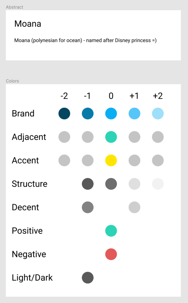
Figure 1 shows the base tokens for moana expressing the branding of the theme. I try to start with the neutral color here in the middle (using HSL with a lightness of 50) and then offset them with more or less lightness into both directions. Others do use color 100-900. It is the same idea, just applied differently – I don’t wanted to spawn a huge matrix here, as I don’t think I ever need that many colors.
Note: As these are base tokens, they are processed further into purpose tokens but should never reach the output of your theme (not directly, unless a hypothetical development build will enable this).
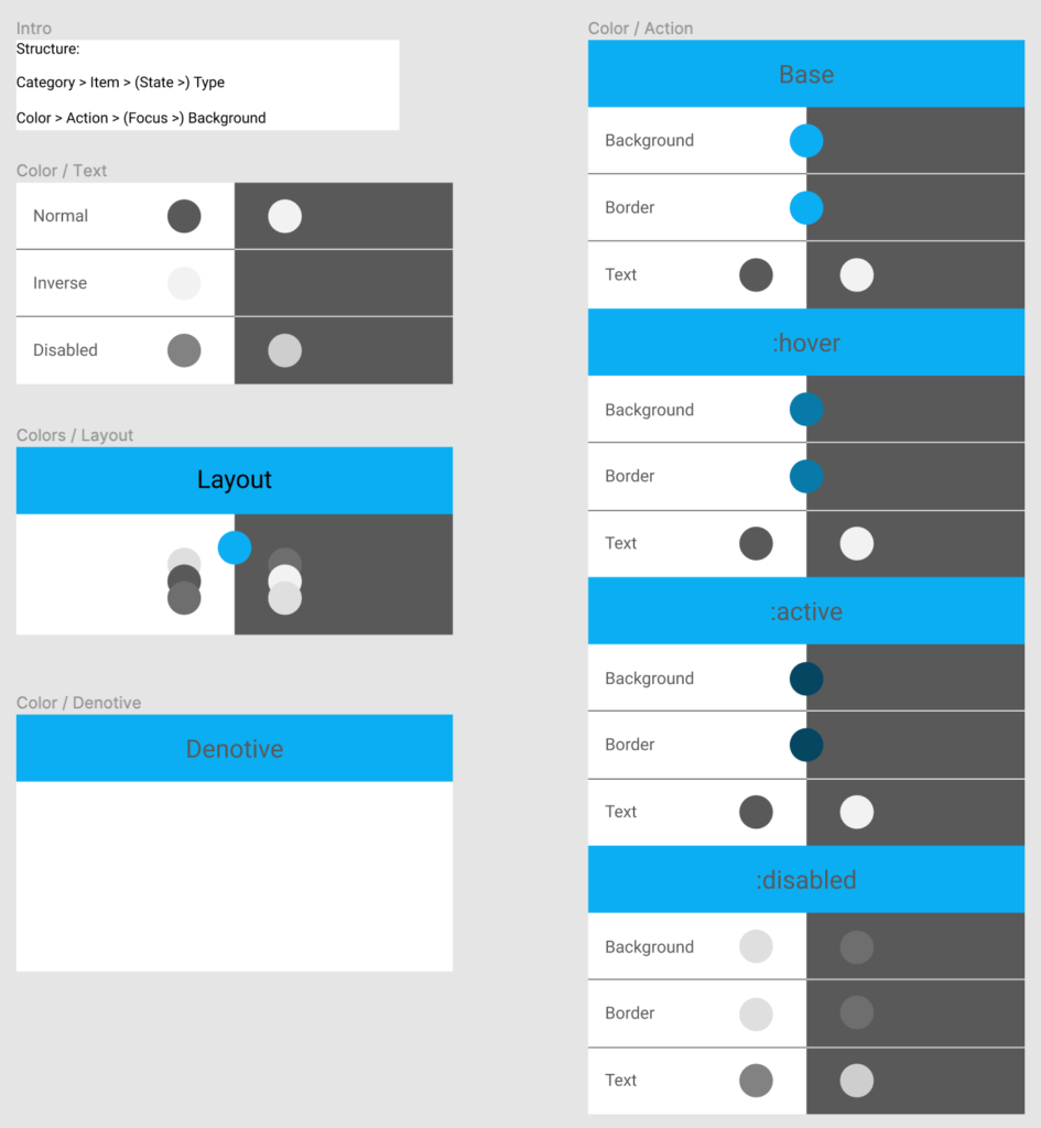
Next step is taking the base tokens and reference them to purpose tokens as shown in figure 2. For example, the action-color block has a base section and defines background, border and text colors and more sections with each describing a state. These color swatches reference a color from the base tokens using the Style References Figma plugin (whenever you change a base token, those will update automatically). Colors here are in light ( on the left) or dark (on the right) color schemes respectively or in the middle if they are used in both color schemes.
Note: Also figure 2 isn’t complete with all purpose tokens, they should cover the majority of actions within your app. If you have special cases where anything has to differentiate from your purpose token, you can still use a component token to express these special cases.
Code
As mentioned in the beginning a theme is a “POJO” package. It doesn’t know in which context it is being used. It is isolated by definition and by that exchangeable. It must however adhere to a naming scheme for all used token identifiers, as this is the interface between your app and a theme. Here is the minimal package.json for your theme package:
{
  "name": "my-theme-name",
  "scripts": {
    "sync": "yarn theemo sync",
    "build": "yarn theemo build",
    "generate": "yarn theemo generate",
    "magic": "yarn sync && yarn build && yarn generate"
  },
  "devDependencies": {
    "style-dictionary": "2.8.3",
    "theemo": "^0.0.4"
  }
}
Theemo provides a CLI tool with commands for each of its actions and we combine them all together into a magic one, because we truly only want to run ONE ! command to do everything! I considered doing more than running one command as a failure!
The next part is configuration. There are two config files theemo.js for theemo and config.js in this case to instruct style dictionary. At this point I refer to theemo getting started documentation which explains this step. If everything is setup, here is what you do:
yarn magicAfter swinging your magic wand theemo will sync your tokens from Figma, executes the build of your token manager tool and generates a ready-to-use css theme file and updates your package.json with information about it (so tools for the follow-up process only need to consult package.json). Here is the output from moana:
Progressively Enhance your Workflow
Progressive enhancement for your workflow comes built-in with theemo. In this article I descrbied all three existing features of theemo today. However you can use one, two or all of them, depending on what you need. For exmample you may start with manually crafting your tokens first and use the build and generate actions from theemo and later on connect it to figma.
Collaboratively improving Theemo
I’m calling for your help to improve theemo. Spin it up for your project, consult the documentation and benefit from your now-faster-workflow.
Is the documentation good? Where it is unclear? What were your obstacles in understanding (parts of) it?
Are you using another tool than Figma or Style Dictionary? Maybe Sketch, Framer X or Adobe XD as your design tool? Or do you use Theo as your token manager tool? These are at the moment unfortunately all not included but I’d like to see support for them and good thing is the architecture of theemo already allows to plug-in extensions for other tools.
For all cases, please reach out to the theemo repository, open issues for questions or discussion – or submit a PR to integrate Theo =) Here you go:
➔ Website + Documentation: gossi.github.io/theemo
➔ Repo: github.com/gossi/theemo
-gossi