
Storybook is a system to develop, document and test your frontend components for multiple frameworks and libraries. This post focuses on the integration between storybook and ember.
This is the third and final part from Figma to Ember to Storybook series, which I make sure can be read on its own.
In this article, I give only a short intro into storybook as the main part of this is to explain the behind the scenes of how storybook and ember work together, what are the technical challenges to write documentation in markdown and what’s the path forward to overcome these technical hurdles to unlock new features.
My project that accompanies my journey is my OSS design system hokulea. I’ve heard the code in there already helped people with their storybook and I hope you will also find something that helps you:
Getting Started
This section is a shallow introduction for storybook, only an appetizer. It’ll end with links at the end that will be the next steps for your journey.
Let’s start by installing storybook for ember:
ember install @storybook/ember-cli-storybookOut of the box, storybook is supporting stories written in javascript and typescript for single- and monorepo.
Ideally, this is all you need to do – but sometimes manual work is still needed, such as running the blueprint or advanced configuration. More background is explained the How Storybook works with Ember section.
At the core of storybook you write multiple stories for one component, each story expressing a permutation in which you can use the component to test, develop and document its possibilities. Let’s take a simple button for explanation:
{{! components/button/template.hbs }}
<button type="button" local-class="button" ...attributes>
  {{yield}}
</button>
/* components/button/styles.css */
.button {
background: darkblue;
color: white;
/* more fancy styles here */
}This is a simple button component with ember-css-modules. A story for ember is a template and optionally a context object. These two stories demonstrate this for the button component:
// components/button/stories.js
import { hbs } from 'ember-cli-htmlbars';
import { action } from '@storybook/addon-actions';

// the default export tells storybook where to put it in terms of navigation
export default {
  title: 'Button'
};

export const Basic = {
  template: hbs`<Button>Click me</Button>`
};

export const WithActions = {
  template: hbs`<Button {{on "click" this.handleClick}}>Click me</Button>`,
  context: {
    handleClick: action('click button')
  }
};
A stories file contains multiple stories, each of them is a named export. A stories file itself is considered a “POJO” module. The idea is a stories file can contain more than stories, for example stub data to feed your stories or your tests and ideally compose stories and data from atomic to greater pieces.
This is storybook basics and shall give you the idea for storybook. There is of course more you can do with storybook and there is a great ecosystem of storybook addons with which you can enhance and customize storybook to your needs.
I only gave an introduction to give you an understanding for what storybook is. There are documentation ready to get you started in more detail.
- Storybook Docs – This is the official docs. The intent for the documentation is to be framework agnostic but showing examples for the selected framework. Since ember docs currently are a copy from react, this might lead to wrong impressions. It’s now up to the ember community to fill it with life.
- Storybook for Ember Tutorial @ learnstorybook.com – An official tutorial by the company behind storybook to introduce a storybook driven development workflow.
How Storybook works with Ember
First of all to understand how storybook and ember are working together are the two independent build pipelines that are running:
- The ember build, as you already know by running
ember serve - The storybook build pipeline
They are glued together the following way: The stories we write are cycled through the storybook build pipeline. Storybook parses the stories, finds the right adapter (they have an adapter per framework/library) which understands the respective story DSL and feeds it into the framework. For most other non-ember-adapters a story is a function, that returns in the frameworks respective format (and by having functions encourage the usage of composition/high-order-functions). For ember we are using an object-hash with template and context to simulate a component in which we are wrapping our story. In fact, this is what the ember adapter is doing under the hood: It takes the story object hash, creates a classic ember component on-the-fly which is what storybook displays.
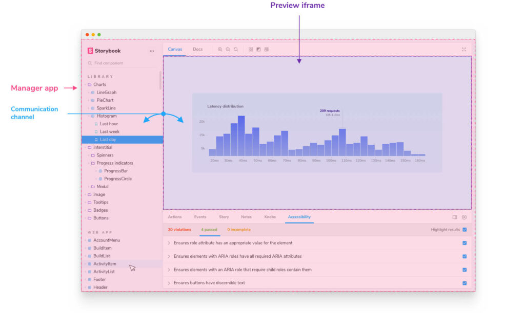
There are two parts of the storybook application. First is what’s called the manager, which contains all the interactive elements, such as the navigation, toolbars and addon panel, etc. – the manager itself is written in react. Second is the preview. This is an iframe in which the respective framework has its residence. These words will help you better understand their documentation.
It also explains why in development mode your local ember server needs to run first before you start storybook otherwise you will see errors.
Let’s go back into the mythical land of build pipelines. The one by ember is powered by broccoli and storybook’s is powered by webpack. Stories are passed through webpack but never through broccoli. When starting with storybook, this can lead to a lot of frustration as you now begin to realize how much magic is built into/covered by broccoli and it’s addons.
Example: Let’s say you used an import from the now deprecated @ember/string package in on of your components. This is a virtual package, only available in ember land, because broccoli pipeline covers for that. Now, when running this through webpack, this will fail as this package can nowhere to be found.
When working with storybook and ember you will likely face more such situations that are explainable through the two distinct build pipelines.
Writing Documentation in Markdown
To enhance the stories you write, the preferred format of choice is markdown. It is very helpful to write more than the demo code of your component or even more, whole sections within your storybook. So, let’s see what options are available to write your documentation in markdown.
MDX
Storybook has a Docs Mode and which contains MDX and DocsPage. DocsPage is for auto generated content and MDX if you want to have more control over it. Docs is written in React and thus can be enhanced with react components, such as those to include stories. The included stories are in fact rendered through preview.
From ember perspective it feels awkward to write my documentation in non-ember code. Even more when I need custom documentation elements I have to do this in react.
Second there is an auto-docs-mode for storybook which takes your existing stories and puts them into a DocsPage. This is of course a neat thing but will follow the rules put into the code to make that happen, which do not necessarily match what you have in mind for your documentation. It may/can be helpful but also not.
Third is that the DocsPage is rendered in the style and design of storybook. When working on a design system, I want to showcase the style of that but instead it will be presented in storybook’s way, also not ideal.
Not all is bad with MDX and for react it does a great job, for ember MDX is ok-ish to write some enhanced stories or markdown documentation, you must figure out if the enhanced docs are working for you.
Storybook maintainers want to improve the documentation situation and reached out to me. My feedback was, that storybook itself shall focus on a good architecture behind, to allow documentation within one framework and do not make cross-cutting efforts of mixing multiple technologies. That way, MDX will stay as a solution for react (which has proven good) but would allow individual frameworks to develop their own solution hooking into storybook’s architecture.
Run Your own Markdown Processor
To compensate the shortcomings of MDX, I developed my own processor to hook generic markdown files into storybook quite successful. It avoids the DocsPage and they are rendered as stories. In order to make that happen, the webpack pipeline for storybook needed an addition:
- The markdown files are processed and rendered into hbs (using markdown-it-ember with the help from markdown-it-compiler)
- The hbs is wrapped in a
<Page>(glimmer) component who’s only purpose is to give this markdown file a proper representation - Links are replaced with
data-*tags for @storybook/addon-links for inner-story linking - The final hbs is processed like any other regular story
Fun fact: Only the last two steps are necessary for storybook. The first two steps are enough to write templates in markdown in any regular ember project (which is what ember-cli-markdown-it-templates is doing).
That way, you can write markdown and use ember components to enhance the documentation in your own styling rather than storybook’s. It has drawbacks as well. You need to maintain your own build step (which can even be a good thing) and there is no way to hook in stories as you would be able to with MDX.
Architecting your Storybook
You can add storybook to any of your ember projects: app, addon or engine. It will be the app or the dummy app that will be displayed in the preview. For addons and engines, storybook will be added as dev-dependency and the dependencies shall hopefully never leak into the final app build. For apps this is a little different as every dependency is installed as dev-dependency. For that you might need to tweak the final build output and exclude storybook related modules/packages.
A more interessting thing is where to give storybook a home(s). There are a couple of factors to take into account: Your repo setup, multi- and monorepo and the architecture of your application (I’m having a Microservice/DDD/context-oriented architecture in mind). For now I can only consider the architecture of your application as a blackbox but I will explain multi- and monorepo solutions and I hope this will help you fit your application architecture into it.
Monorepo
In a monorepo with multiple ember packages, I encourage for one dedicated addon as a home for your storybook. You are then able to find stories from all packages within that monorepo. Find a clever way to structure your navigation within storybook and everything will fit together. Even a dedicated documentation folder with markdown files to enhance your components will be a nice fit.
Demo: hokulea – the explorer package is the dedicated home to storybook and does nothing else.
Multirepo
The effort for multirepos seems a bit higher, I see two ways of doing it:
- One repo to hold the storybook instance, then develop a build process that checks out all repos at once and treat them all as monorepo, do the above
- Each repo to have their own storybook instance. Use Storybook composition to have them in a centralized instance.
Personally, neither of these options feels good.
Multi Monorepos
As best of both worlds and with a matured size of your application, it might be useful to think about multiple monorepos with one instance and a central storybook that glues them all together and make them your place to go.
Feature Waiting Hall
There is a lot more for ember and storybook to come and I’m happy to give you an outlook.
Auto Documentation
Storybook already supports Args for stories. They are ideal to be the arguments for your components, unfortunately do not have the best support in ember. With args storybook can automatically create an ArgsTable for your component within DocsPage.
I tried to do that already but with the two build pipelines it is at the moment not possible to import glimmer components into the webpack pipeline. Happily some work has already been done to get there:
- RFC #678 – Documenting Components
- @josemarluedke recently released glimmer-docgen-typescript which favors the format from the beforementioned RFC
- Issue #320 – Import glimmer component into non-ember build pipeline – I tried glimmer-v2.0beta for this. It’s looking better than v1 but not yet good enough.
This list plus the markdown issues from above. It’s a huge effort to bring this together, yet there are couple of stakeholders with similar interests to move this forward which gives me a lot of joy.
Glimmer Components for Stories
Writing stories in the current format with template and context object still feels awkward. It seems be a component you write but in reality isn’t. I’m playing around writing stories this way:
// components/select/stories.js
import { hbs } from 'ember-cli-htmlbars';
import Component from '@glimmer/component';
import { action } from '@glimmer/modifier';
import { tracked } from '@glimmer/tracking';

export default {
  title: 'Select'
};

export const Basic = {
  template: hbs`
    <Select
      @options={{this.fruits}}
      @value={{this.selection}}
      @select={{this.select}}
    />
  `,
  component: class extends Component {
    @tracked selection;

    fruits: ['Apple', 'Banana', 'Pineapple'];

    @action
    select(selection) {
      this.selection = selection;
    }
  }
};
I would find it more pleasent to write real components as my stories. To make this possible it is the same challenge as above with Args. Alternatively to an @action you might wanna import {{set}} (from ember-set-helper) or {{on}} (from @glimmer/modifier).
Alternative 2: With exportable components, they might just be used as is, so this can also become a thing (keep in mind, this is temporary single file component syntax):
// components/select/stories.js
import { hbs } from 'ember-cli-htmlbars';
import Component from '@glimmer/component';
import { action } from '@glimmer/modifier';
import { tracked } from '@glimmer/tracking';

export default {
  title: 'Select'
};

export const Basic = class extends Component {
  static template = hbs`
    <Select
      @options={{this.fruits}}
      @value={{this.selection}}
      @select={{this.select}}
    />
  `;

  @tracked selection;
  fruits: ['Apple', 'Banana', 'Pineapple'];

  @action
  select(selection) {
    this.selection = selection;
  }
};
API Docs
For hokulea I was able to make API docs that are part of storybook. For that I followed the documentation for components as much as possible from the RFC mentioned above plus applying docblocks with parameters from api-extractor / api-documentor. The combination of them two is able to produce a documentation in markdown. Since I already managed to make stories from markdown, I only needed to glue them together and tada had auto-generated API docs within storybook. This is no surprise it worked but it is also a very hacky situation. From what I heard there is also interest from storybook’s side to make this a real thing. I imagine something like the following:
Each framework will have a connector to provide API docs in a certain format (for now I consider the output from api-extractor as suitable for this).
For storybook: there are adapters that take this as input and format this into a framework-understandable form. For example, ember has named blocks, vue has slots, etc. The adapters take care of DSL specific formats. They will feed the auto documentation with that information and are also capable for full API docs.
For ember: I can imagine multiple adapters for other documentation systems such as docfy or empress products. They will also have adapters that take the output from api-extractor and transform it into their format. Bonus points if they are incorporating stories, since they are considered “POJO” modules 😱 At least that describes the idea for stories from a different perspective.
One challenge already on the radar for API documentation are the module exports. The trend of the javascript ecosystem is to have one entry point with multiple named exports per package where in ember traditionally you have submodules/multiple entry points, e.g. import ButtonComponent from 'my-package-name/components/button'; Tools, such as api-extractor work quite well with single entry points (and even hardly allow multiple ones). There is already a discussion called Single File Addons and it is also worth reading the explanations from when I asked for help to use api-extractor with ember.
Primitive Baby Steps
In order to bring these features to life, this needs to be handled at various places. From ember core over ember userland to storybook (or other documentation tools). One strategy that has proven to be good within ember is to focus on the primitves and then scale them up. I see this is a feasible for the situation here. Here are the tasks to make this fully possible:
- Move the RFC for documenting components forward (ember)
- If approved add the necessary changes and publish the packages (ember + community contribution)
- Ember addon to incorporate api-extractor for the whole code (ember userland)
- Import Glimmer components in a non-ember build pipeline (ember)
- Storybook to provide an architecture to create framework beneficial markdown integration (storybook)
- Storybook adapter to extract information from api-extractor and feed automatic documentation (storybook + storybook ember community)
This is a very exhaustive list to go through and likely includes more than what’s accomplishable within a ~year. The list on the other hand shows something else. Each of theses tasks unlocks possibilites. Playing this gamification and the workarounds and hacks listed in this article, all of this is already possible today although far from what is imaginable of course. The start is ideally to incorporate api-extractor and from there on play it upwards.
Looks like a journey for this year.
-gossi