
The main motor is the idea to establish a workflow from Figma to Ember to Storybook. This article is the first in the series of three yet can be read for itself independently. Shown conventions should also serve the purpose of connecting Figma to other systems.
Secondly I wanted to understand the world of design systems, not only from a developer perspective but also from designers by going through the flow from the beginning to end. In combination with the recommendated articles about layouting mechanisms at every-layout.dev (by Heydon Pickering and Andy Bell) this projects connects everything together.
Having a workflow that clearly separates concern is crucial, in Figma as in development or in your agile setup. As a developer using ember, I’m pleased with given conventions which are decisions of already solved challenges that thankfully take away some of the mental struggles. Opening Figma gives you a clear canvas and I was seeking such conventions. After playing around with Figma and understanding roughly how it works, I come up with such conventions on my own, that allow me to keep things structured and organized. This is the story to it.
Project: Hokulea
Make a design system in Figma, connect it to Ember and Storybook, with support for different themes in various contexts and automate most of it.
To give a high-level overview of the project in Figma:
- Theme Document(s) – one document per theme
- Components Document
More detailed explanations follow as the article progresses. For the start it’s enough to know, there will be one document per theme and one document for the components – you can see on the links above to my project in Figma.
I called the project Hokulea and the theme showcased here is named Moana (yes, after the Disney princess!).
Themes and Features
With a theme I understand a centralized store for design decisions. Exports vary depending on supported features, which affecting the scope to grow rsp. shrink. Typical consumers are your component library, your foundation layer (also for some that may be the same group, which is totally fine) and of course the screens for your product. Let me explain more of those features, what do I mean by a “full featured theme” and how they affect the scope of a theme (I prefer to say scope but you can also understand it as size).
Design Tokens
The term design tokens was made popular by Jina Anne and Jon Levine with their iconic talk “Using Design Tokens with the Lightning Design System” back in 2016. Anne give it a definition in a tweet that is also displayed on the Design Token W3C Community Group:
[…] technology-agnostic architecture and process for scaling design across multiple platforms and devices, including native, and more
Anne
Personally, I like the way Nathan Curtis puts them as “Design Tokens, Decisions Propagated Through a System” – with emphasize on the propagation aspect – as this implies postprocessing and resonates for me with the scaling aspect Anne mentioned. Design tokens are usually grouped by their type, such as typography, colors, sizing, shadows, etc.
Figma already has great support for them built-in and calls them Styles. They are found in the panel on the right and can be exported and imported by other documents.
Contexts (or Modes)
Think about contexts as light and dark mode of a theme (In earlier days there was often also a so-called high-contrast mode – luckily now everybody does check accessbility, so hopefully those are at extinction).
Figma doesn’t support references of styles (I shared my experiences earlier) and in order to achieve contexts plugins come to rescue. There are two plugins I know of that are very helpful with that:
- Themer – which let you create two documents, one for dark the other for light theme, then manage those by Themer and switch between the themes, e.g. at your component library or app screens (Themer also supports this to be in one document by prefixing styles!).
- Style References – I built this on my own to support me with that and I will explain below how this works.
Note: Both plugins work perfectly together in harmony as demonstrated further down.
Refrences / Aliases / Mappings / Configuration / Whitelabeling
There is a lot of names describing the third feature, I go with References. Imagine you have multiple themes each representing a brand on your platform. You were smart enough to encapsulate each in a theme. Your primary button uses the primary color and your main screen shows the headlines in your primary color, too. Now one of your brands requests to change the heading color to something else – what you do? Changing the token to another one or changing the value of the token? Neither works as each has implications on other occurences for this token with that value.
The solution is to have a step in between, where you reference the technical oriented design token to the location of that use-case and create a semantical mapping for between them.
This feature was the my main purpose to develop the Style References Figma plugin, to support this use-case within Figma – explanation of usage is below.
The references part increases the scope of a theme by far, as there will be a lot of them.
Theme Scope Summary
I explained the different features a theme can support. They are different from case to case. What does your theme support?
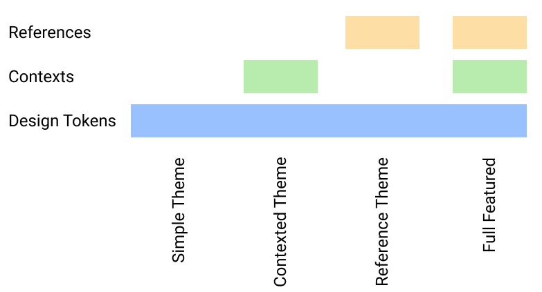
Figure 1 shows an overview of the the features and their combinations for themes. A “full feature theme” contains design tokens + contexts + references. The article continues with an explanation for how to manage such a theme with Figma.
Organization and Conventions in Figma
With the explanations above and the introduction, the goal is:
- A full featured Theme (one theme in one document)
- Design Tokens
- Multiple Contexts
- Semantic References
- Conventions for Organization
Having everything theme related in one document is crucial. That makes all other parts independent and themes interchangeable!
The sample project I’m using and refering to is – at the time of writing – only using colors but will be enough to transport the idea (see links above).
Naming Styles for all Features in the Theme
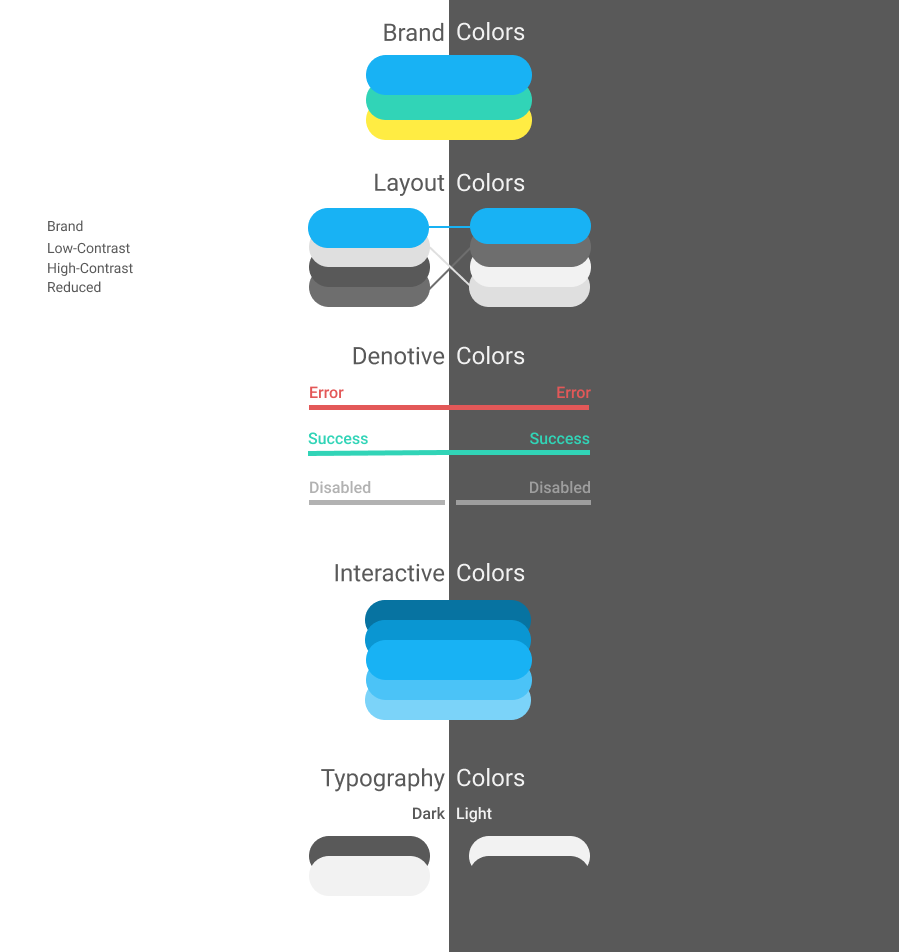
For colors, I come across this wonderful video from Joseph Angelo Todaro where he talks about “How I Organize Colors for a UI Design Project“. I liked the idea. I’m pretty sure that are way too many colors for what I need right now but I was also trying to learn the designers perspective and thought this is a good idea to do so (Figure 2 shows the final outcome).
Design Tokens
These are the design tokens and they are separated into light and dark mode. Colors that are the same for both contexts are overlapping both backgrounds for visual inspection. If that doesn’t work out, they can be split and separated.
Contexts
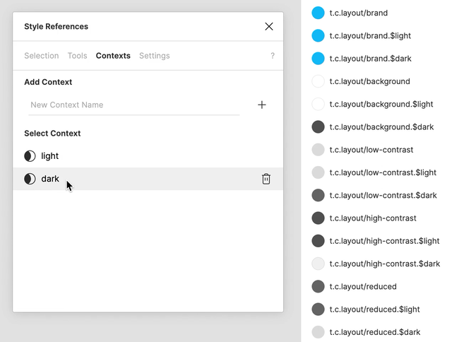
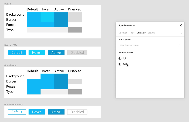
Context switching is not built into Figma – luckily I developed the Style Reference plugin 😉 which helps out. It’s just styles with a custom defined suffix pattern. Take the background as example, there are styles for each context: t.colors.layout/background.$light and t.colors.layout/background.$dark and the plugin will reference the selected context to t.colors.layout/background as shown in Figure 3.
References
Handling references within Figma was the main purpose of developing the Style Reference plugin. What doesn’t work in Figma here:
- Create a rectangle, give it a style.
- Create a second rectangle, use the style, unlink it and create a new one.
Now, the two rectangles have the same visuals but the styles are different and changing the first one, doesn’t change the second one, which is where the plugin chimes in. Here is how (as illustrated in Figure 4):
- First select the node on which you want to create a reference and open the Style References plugin
- Select the origin style
- Name the reference style and link them
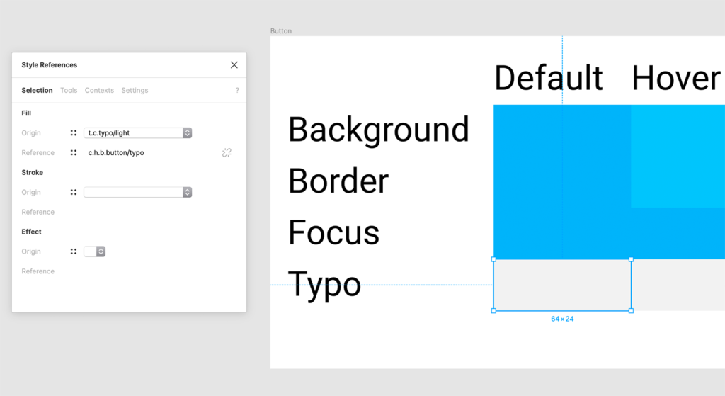
Now as long as the plugin is open, whenever you change the origin style, those changes will be copied over to the referenced style.
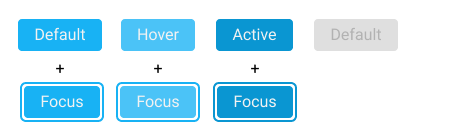
This mapping allows a “live-section” of our references with dummy structures (just a rectangle) that applies them as in the real example (primarily to have foreground and background work together). Arrangements like this enable to use the aforementioned context switch to swap between them and see changes live in action (animated in Figure 5). Furthermore use it to check the contrast against accessibility guidlines, I use A11y – Color Contrast Checker.
Established Conventions
The conventions I come up with was mostly with naming things. Taken into account are not only the organization in Figma (based on naming) but also how this will be exported and consumed by third parties.
Naming Styles
These schemes are conventions for naming styles:
Tokens:

t.{type}.{section}/{name}(.${content})

References:

c.(hokulea.)({package}.){component}/({state}.){name}

Legend:
{} = variable
() = optional
Examples for Design Tokens:
t.colors.brand/b-1
t.colors.layout/background.$light
t.colors.layout/background.$dark
t.colors.denotive/disabled
t.colors.interactive/i-0
t.colors.typo/normal
t.colors.typo/inverse
Examples for References:
c.hokulea.buttons.button/background
c.hokulea.buttons.button/focus
c.hokulea.buttons.button/active.background
c.hokulea.buttons.button/active.focus
c.hokulea.cards.card/border-color
c.hokulea.cards.card/focus
The explanation takes into consideration how Figma allows grouping based on your naming as well as how these names – when exported – can be processed “best”:
- The
tindicates: “this is a token”. - The
cindicates “this is a component” (= reference). - The
/as separator for Figma, it groups them after the last(!) slash. - The
.as separator that becomes very useful when exporting them. - The lower-case because I’m a developer (:p), have a german keyboard layout and try to avoid the shift-key as much as possible and spaces are also often critical when exported so I avoided them, too.
- The references are prefixed with
hokuleathe name of the component library. That is, if this theme is used in a product, it’s namespaced away clearly and the main namespace is open to the product. - Components that have states (eg. active, focus, disabled, etc.) they take those as prefix to the actual name.
- In the examples
focusis the state on the state and contains the value for the color, whenever that state is focussed (there is room for improvement).
Figma only has limited space for showing styles, that’s why I shortcutted them, e.g. t.c.* instead of t.colors.*.
Document Structure
The theme document has multiple pages:
- Cover (you want to give it a nice splash screen for your project listing)
- Branding (for the tokens)
- Hokulea (for references to the component library)
- _Utils (Components to support organization on other pages)
Each page (apart from Cover, Branding and _Utils) is considered as a namespace for references. In this case, Hokulea is the only namespace used. Imagine you copy this theme for your product – you might be using hokulea or not – each page becomes a namespace for either your used libraries or each of your products modules.
Working with your Theme
Now that the theme is there the next step is to connect it to other parts. As stated in the beginning there is another document for components, that consumes a theme. It takes the references and applies them to components, figure 6 shows the button as example.
Of course at the components page, we want to switch between different themes. At this point I used Themer, as this is its intended use and shown in figure 7.
Workflow for switching themes in your component library:
- Theme document:
- Define design tokens
- Define contexts
- Create references
- Publish styles (Figma will prompt you)
- Create theme in Themer (or update existing one)
- Component document:
- Update imported styles (Figma will prompt you)
- Open Themer
- Select theme and apply it to the page
Workflow for switching the context in your component library:
- Theme document:
- Open Style References plugin
- Switch context
- Publish styles (Figma will prompt you)
- Component document:
- Update imported styles (Figma will prompt you)
Bootstraping Themes
While a theme is in development, you will primarily want to work with one main theme, which acts as your master. That works pretty well but from time to time I learned it is good practice to focus on a second theme to verify you have changed every reference or any relevant style to have the right one assigned for your theme. I baked export and import of references into the plugin to assist with that. Here is what I do:
- In my main theme, open Style References plugin and under the tools section, hit the export button (see the help part how to configure it)
- In the project listing, duplicate the main theme
- In the copy, open Styles Refeferences plugin and in the import section, paste the URL from the main theme export and import it.
- Now references are available in the new document
What would be the best follow up now is a second import step for all colors, typography, etc. that you defined in a third document with its only purpose of serve bootstraping. I tried to do that with Themer but it cannot map imported styles to local ones. There goes the last manual bit. I – for example – will update the design token colors (I manually copy them over from my bootstrap document). It will take me around 5 minutes – at least I minimized the effort for this task – not fully automated yet 😉
Business Perspective
While setting up all this and even further than this article explains into development, I realized one thing that I wasn’t expecting at all but is very helpful and I want to share it. Regardless whether the people/person working in this setup is a one-(wo)man-show or a functionally, diversified team the split this process introduces by assigning clear roles and ownership to the various steps is incredible. Different departments are granted their area of work for which they take ownership and the links between them define overlapping/collaborative work of respective teams and support the handover from one to the next station. Identified roles and their responsibilities:
- Design Tokens / Branding
When working on the design tokens, it is clear decisions made here clearly affect the brand of your product – usually a collaborative effort between branding and design departments. - References / Design
Referencing the design tokens to their semantic usages is what designers take on, once branding is ready to move on. Not only responsible for the mapping but also then applying them onto the designs you create – components, pages, screens, you name it.
Naming the tokens is a collaborative effort between design and developers, so they follow a naming scheme that can be carried over. - Implemetation / Developers
Depending in which environment you are working, some of those steps are automated in other times, developers implement this manually by copy-pasting over values. This has a margin for errors. When automated, a single click syncs in all those from design resources. This way giving responsibility and ownership to design and Figma becomes the single source of truth while at the same time lowers the risks for manual errors being made.
Kaelig described the role connecting design and developers as Design Systems Ops.
Conclusion
I explained how I understand themes, their features and how to organize a full featured theme in Figma. Creating a plugin to help automate many steps to speed up development process and finding conventions that guide designers and developers and gives them a language for exchanging their assets.
I was happy to explore the design perspective on this side and already learned a lot (and realized more areas to improve – I still can do designs faster in html/css than in Figma :D). Most surprising was for sure the perspective from business and how this gives functionally diversified teams ownership and responsibilites over their own context.
One more thing: Hop over to the result of this in storybook
-gossi