
Design system architecture with focus on design tokens, that form the vocabulary of your visual design language, helping to streamline the communication amongst stakeholders. Modeling the system with boundaries to ensure clear purpose and predictability for design tokens and stability guarantees with fine control for theme authors.
This article is part of the Inside Design Tokens series, which splits into 10 articles:
- Definitions & Traits
- Features
- Modeling & Communication <– this article
- The Three Class Token Society
- Put your Tokens on a Scale
- Token Specification
- Naming
- Theming
- Internals
- The Hidden Knowledge
Putting design tokens to use is an art and craft. An often seen failure is to jump to the implementation details too early by copying ideas from other design systems and creating design tokens, that might look ok-ish yet don’t capture the workflow, the processes, language and vocabulary of your organization.
Workflow, Processes and Communication
A design system (DS) brings people from multiple disciplines together and the DS team has the pleasure to work and communicate with them. Some stakeholders provide input, others demand output and the job of the DS team is connecting from one end to the other; building bridges preserving the various interests of stakeholders. Develop communication patterns with stakeholders, establish processes for efficient time and resource management and over time define and refine the workflow’s rhythm.
Models & Architecture
Modeling your design system is the first step to visualize your communication and processes – within the system and to stakeholders. The model likewise is the architecture defining the language and vocabulary of your system. This series explains two methodologies to do this: Domain-driven Design (DDD) (Evans, 2003) and Object-oriented UX (OOUX) (Prater, 2015). Using them to design the architecture from a holistic view down to the individual level integrating concept and implementation (Evans, 2003, p. 328) gives us two perspectives to look at a design system:
- Strategic Design: The conceptual idea and model of the system
- Solution Design: The detailed implementation of the former
Being conscious about which design you are speaking helps to mitigate problems, such as: “But conceptually this is different, no?”
Strategic Design: Modeling the Domain of a Design System
You are in a new city for the first time – what helps you to orientate, navigate and find the place you are looking for? A map!
A strategic design is the map of a system, organized with clear boundaries and responsibilities to keep it maintainable yet open for change. The map shows where to find and place things and contains defined homes. Definitions for shaping boundaries help to orchestrate change. Providing a system in which change can happen has another benefit which Linda Dong explains as a scalable system is replicable (2019), contemplating idempotence of the respective contexts.
Here is a sample design system domain, broken apart in several subdomains and bounded contexts (Vernon, 2013, p. 43ff).

The challenging task is to define the subdomains and to distill the bounded contexts. Following is a discussion explaining how to do that.
Core Subdomains: Components + Visual Design Language
First is to identify the core areas of a design system, those that uniquely distinct it from other products. These are the components and the visual design language (you may call it the foundation). Within these subdomains we’ll find elements that appear in almost every design system, in addition to that are parts specific to your business. For the former, the Interface Inventory Blueprint by Jan Toman is a good start. The “headlines” (aka the pages) of the inventory section is a good resource of inspiration.
Next step is to define the bounded contexts (Evans, 2013, p. 335ff). Explicitly set boundaries, in which clear definitions communicate its purpose, to keep the model predictable.
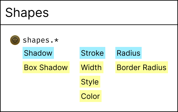
Putting this into practice by drawing bounded contexts within the Visual Design Language Subdomain. The purpose for this subdomain is to provide discrete instructions to assemble a user interface (or components). The bounded contexts typography, surfaces, shapes, interactivity, etc. contain these assembly parts in a way, that each communicates through instructions where and when to use them for. With these a designer/engineer can now construct a component or builder larger scale user interfaces.
Within the Component Subdomain this assembling is practiced by providing the composition of selected assembly parts for a particular purpose.
A goal of this strategic design is to communicate the usage the design system:
- Is your purpose already conceptualized in the component subdomain? Please pick it from there.
- Need to modify it? Select customizations from the assembly parts.
- Need to create from scratch? Compose from the assembly parts.
And more importantly: Gives theming authors safety and fine control. When choosing a value for a particular token, the purpose for that token usage is clear through the bounded context and theme authors can ensure predictability for token consumers, as tokens wouldn’t show up in unexpected locations.
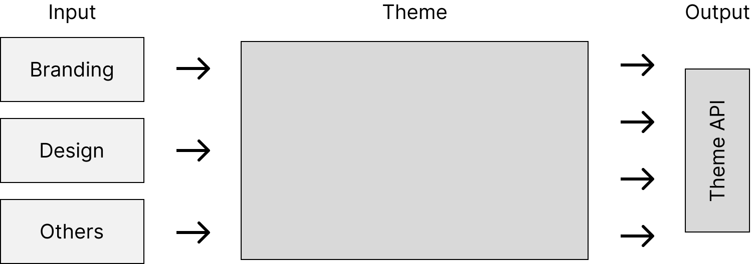
Supporting Subdomain: Branding
In the supporting subdomain are elements complementing the core, but are of supporting or ancillary nature. It is essential for the system to support (multiple) brands yet this isn’t the core (Vernon, 2013, p. 52). The branding subdomain is a perfect location to place all aggregated inputs received from stakeholders.
For example: input from branding department can be the choices for typography and colors and they are using the design system themselves. On the other hand branding department might be more on the side of print design – their colors and typography must work on posters and big walls, here the story would be to transport the brand from print into digital and keep telling a consistent story for customers.
Depending on the received input, there are potentially more ancillary “ingredients” to define. If colors and typography is provided, then sizing might be missing and must be worked out internally – the supporting subdomain is the place to do that.
Communicating with Design Tokens
The strategic design models the entire system and design tokens are included citizens. A filtered view reveals design tokens within the structures of subdomains and bounded contexts.
OOUX is great choice to describe design tokens, using objects, content, state and relationships accordingly.
Connecting OOUX with the Design Tokens Format Module (Banks, Vitan, Nash, Powell & Chenais, 2023):
- Object (Design Token): Design tokens are objects, consisting of one to many properties.
- Content: The value(s) of a design token, named after the technical property. A primitive type will have one property, a composite type lists multiple properties.
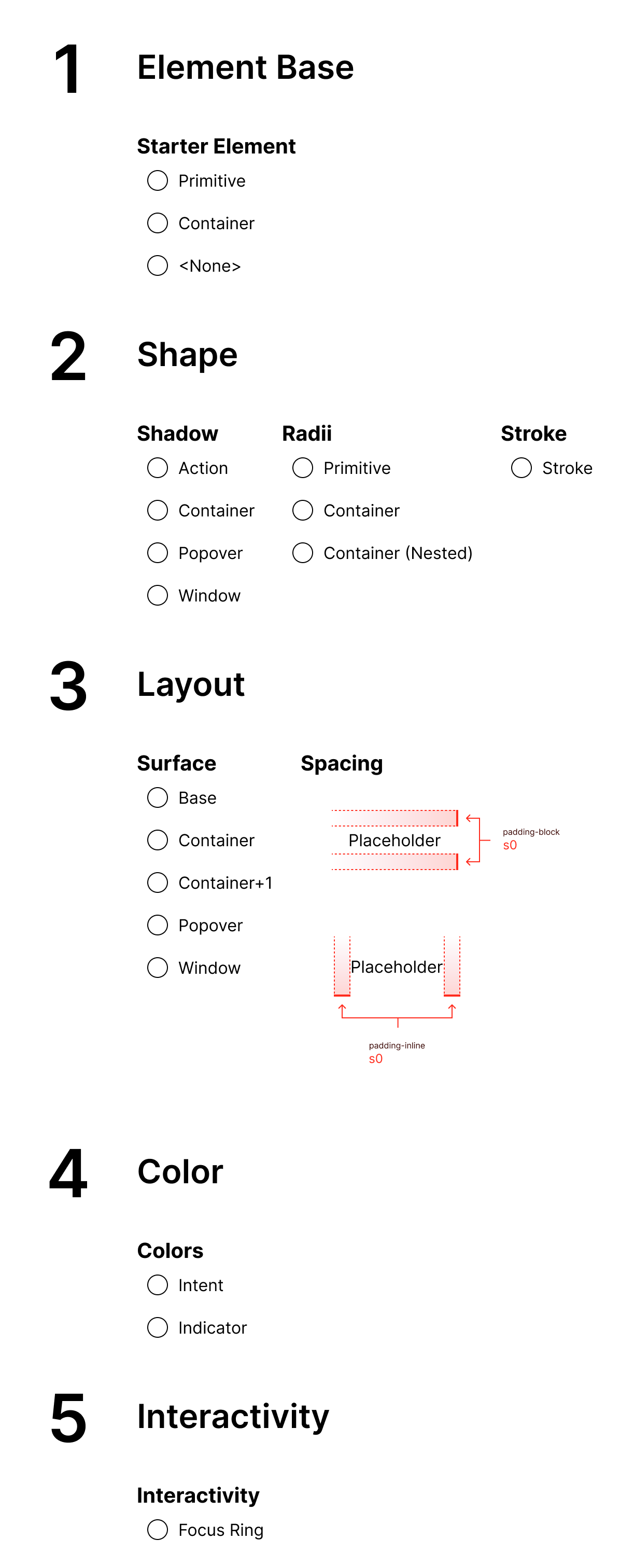
Think of objects for design tokens as classes, which have their own instances. For example, the Shadow design token object, will be represented as:
action– for actions/controlscontainer– for structural elementspopover– low-layer overlays (popup menus, tooltips)window– for dialogs and window elements
These concrete instances follow the concept of a Shadow token, yet have different values.
A design token with properties forms the atomic citizen in the model. They can be composed into partials that encode a certain aspect to reason about and meant to be assembled with other tokens or partials to form a particular interface element.
- Object (Partial): Composite of tokens and other partials
- Content: Values (same as above)
- State: Partials contain state (hover, active, focus, etc.) modifying the values (border, background, etc.).
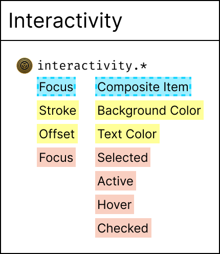
Explanations for the partials:
Focus: The partial has a stroke and an offset for a focus ring and this is active when the element this is applied to is focussedComposite Item: In this case means items within a list(box) or menu. You tap into it for control, then use the arrow keys to navigate within. That changes state for these items betweenselected,active,hoverorchecked. The partial models these states and guides implementation in Figma or CSS to respect these states.
Engineers might recognize partials from partial (function) application (Wlaschin, 2014). The purpose for which partial functions are used matches the use-case for partial token objects.
Using OOUX for modeling design token (partials) keeps the model technology agnostic and guides implementation for designers and engineers. Tokens and partials are described what they consist of and what’s their purpose. Suited to communicate and reason about them.
For example a class for Shadow: Designers and engineers can communicate that a particular element x has a shadow, not saying which explicit instance of a shadow, but stating it has one. Instances are created based on the solution design.
Explain Design Token Usage with Storytelling: The Token Menu
Teaching people to use the visual design language in the way it is supposed to, is another level of complexity. It is fair to consider strategic design models (in whichever way they are crafted) to be complex at first. To ease adoption, using story telling for explanation has been shown helpful.
Here is a way to use a restaurant menu to explain design tokens. This particular restaurant offers bowls and customers are able to pick their own ingredients, but are guided through the process. The process has to be quick for the restaurant to process many customers for business profitability and understandable for customers to be able to perform their order. The menu guides through this process by picking a starter first, protein second, marinade as third and more steps to add ingredients to complete a custom order.
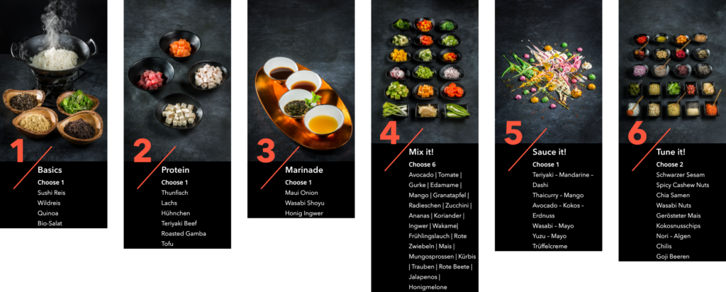
Likewise, the same idea can be used for design tokens when developing a new component. Begin with a starter element that has some properties pre-configured (or start from scratch) and then add more and more tokens for your component until finished.
References
- Banks, D., Vitan, D., Nash, J., Powell, K., & Chenais, L. (2023, Jan. 18th). Design Tokens Format Module. W3C Design Tokens Community Group. https://tr.designtokens.org/format/
- Dong, L. (2019, February 27). Designing A Comprehensive Color System [Video]. https://www.youtube.com/watch?v=bmeo_13QtrU
- Evans, E. (2013). Domain-Driven Design: Tackling Complexity in the Heart of Software. Addison-Wesley.
- Prater, S. v. (2015, October 20). Object-Oriented UX. A List Apart. https://alistapart.com/article/object-oriented-ux/
- Toman, J. (2022). Interface Inventory Blueprint (1.1.0). In Figma Community. https://www.figma.com/community/file/1090652945374511460
- Vernon, V. (2013). Implementing Domain-Driven Design. Addison-Wesley.
- Wlaschin, S. (2014). Functional programming design patterns [Video]. NDC London. https://vimeo.com/113588389