
Design tokens become scalable when they are replicable. A token specification is a formula for achieving design tokens scalability and tools interoperability.
This article is part of the Inside Design Tokens series, which splits into 10 articles:
- Definitions & Traits
- Features
- Modeling & Communication
- The Three Class Token Society
- Put your Tokens on a Scale
- Token Specification <– this article
- Naming
- Theming
- Internals
- The Hidden Knowledge
A token specification (or scheme or formula) lives within a bounded context and turns parameters into tokens. The formula assists to mutate the set of tokens, either in adding or removing tokens. The formula ensures a scalable system through replication as Linda Dong (2019) explains. Furthermore it serves as dictionary to translate tokens from one tool to another.
There is a couple of reasons formalizing your design tokens.
- Support for design tokens varies from tool to tool. Tokens (Styles) in Figma are “typed” (e.g. colors or text) and you cannot use them wrong (that is by-design). However, design tokens as CSS custom properties for example are typeless and invalid usage is possible (you can use a sizing token for a color property). There is no technical constraint in using the wrong design token (the value would be ignored then).
- Naming is related to the nature of tools. A color style in Figma doesn’t need to contain the name
color, as this is by design. Whereas for CSS havingcoloras part of the name helps to prevent invalid usage. How should the names translate from Figma to CSS? How to achieve the same experience for designers and developers alike? - Tool specific handling: In Figma, styles beginning with a
.are not publishable (= internal tokens of a theme). Should they be exported to a token translation tool? Yes? No? It depends? In case of dev sync they might be exported; for a production sync likely not. - Your design tokens come with rules for how to combine them, ie. foreground and background colors. If these rules are not defined, chances are when changing values, the tokens no longer fit together and create disharmony in your design. In order to prevent that, define these rules in written form as part of a token specification.
- A token specification helps to identify design token inconsistencies and bring them into harmony. Do you use a certain segment of the name to indicate a stronger visual prominence over another token? Do you use
primary/secondaryfor one set andaccentuatefor another set? Why not align them to use a common pattern?
Appliance
A token specification consists of:
- Purpose for this token specification
- Formula with parameters returning a Token URI
- Parameter explanation
- Token URI explanation
- Usage Examples
A Token URI is valid within a given system and can be:
- a token name
- a storage location
- another important identifier for your system
Models and scales focus on the domain of the system. Token specification requires to also include the technical side of tokens. Parameters are of domain and technical nature:
- Domain: Actions, Indicators, Surfaces, …
- Technical: Color, Dimension, Border, …
Following are two examples from Theemo theme. The examples are the upper part and explained below the ruler.
Example: Instructions
Instructions are for any form of action a user will do in order to change something in the system. Visually speaking buttons, links, menus, menu-items, etc. Those instructions follow a certain intent the user is about to do. Instructions are interactive and apply these interactive states:
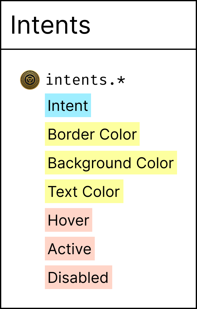
Intents
- Action (default) – normal action
- Alternative – when there are more/alternative options
- Highlight – when a certain action should be highlighted to stand out against others
- Danger – something of caution
Importance
This defines how intents of the same kind are visually more important than another one.
- Supreme (default) – Eye-catcher – very much accentuated; visually a “fill” style
- Subtle – Of lesser importance; visually an “outline” style
- Plain – Of least importance; visually a “text” style
Formula
Figma: intent/$intent/$importance/$state/$property
CSS: --intent-$intent-$importance-$state-$property-color
Style Dictionary: intent/$intent/$importance.json
Parameters:
$intent– see above$importance– see above$state– refer to the model$property– is eithertext,borderandbackground
Return:
- Token URI:
- Name in Figma and CSS
- Storage Location for Style Dictionary
Explanation
The most straightforward case of a token specification for a chosen bounded context. Domain and technical parameters are found in the formula.
- The domain related ones align on purpose scales (
$intent) for fast selection and pattern scales ($importance) offer choices for customization. - Technical parameters (
$stateand$property) relate to mechanics of used technologies.
This formula allows to add and remove intents as this become a necessity. The schema allows discovery of token names for designers and developers. Engineers maintaining the token pipeline are given the business rules to translate tokens from one tool to another.
Example: Color Palette
Color palettes are internal to a theme. They offer token designers choices for colors and their combinations.
Formula
Figma: .palette/$color-$level
CSS: --palette-$color-$level-color (dev mode only)
Style Dictionary: palette/$color.json (dev mode only)
Parameters:
$levelis a value from100to900$coloris a brand related identifier
Return:
- Token URI:
- Name in Figma and CSS
- Storage Location for Style Dictionary
Rules:
- Tokens are available within a Figma file/theme
.paletteindicates an internal namespace- Tokens are never exposed to consumers in Figma (since they are internal)
- Tokens are not exported to CSS in production sync
- Tokens are exported to CSS in dev sync
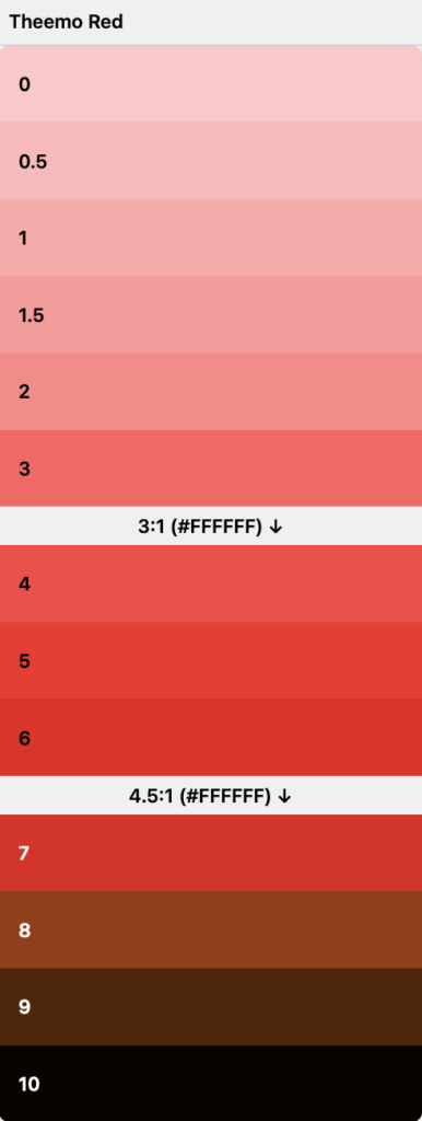
- Color levels >= 700 can be combined with a bright (white) foreground color as it ensures a contrast ratio of 4.5:1. Everything <700 is to be combined with a dark foreground color.
- Colors levels <= 600 combined with a dark foreground color meet the contrast ratio of 3:1 and can be used for large texts
- When colors are used in that form, they comply with WCAG 2.1 Success Criterion: 1.4.3 Contrast (Minimum)
- The thresholds (600 and 700) might even differ between colors, which must be noted on each scale.
Explanation
The color palette example is more opinionated than the instructions. The same idea about parameters and return types, but the rules the color palette comes with makes them opinionated. These must be communicated to token designers to apply and use them appropriately.